Business Intelligence (BI) agent - (Chart agent)
About Chart agent
The Chart agent is designed to accelerate your data analysis by connecting directly to your workbooks and data sources and delivering the insights you need in seconds. It allows users to transform raw data into professional insights using natural language.
Watch a Quick Demo
Interacting with the Chart agent
Interacting with the Chart agent in DataGOL is a streamlined process designed to move you from raw data to visual insights quickly. Based on the platform walkthrough, here are the step-by-step instructions:
-
Prerequisite: Prepare your data (The golden layer)
Before starting, ensure your data is ready for the Chart agent to analyze. The foundation of a successful Chart agent use case is a well-defined golden layer, which is the final, most refined stage of a data pipeline. Refer to Building the golden layer
-
Launch the Chart agent
Based on your workflow, the agent could be accessed from two primary locations:
-
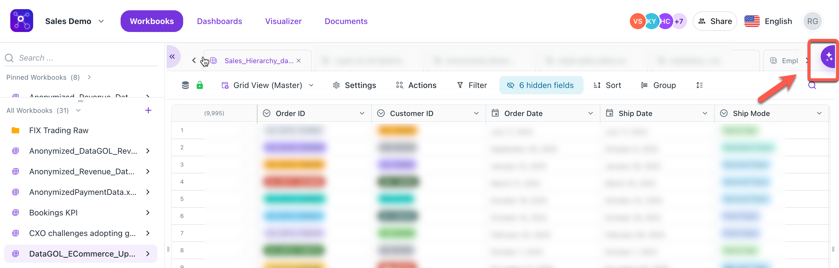
Workspace level: Click the AI icon located directly on the workbook page. This is best if you are already looking at your data.
-
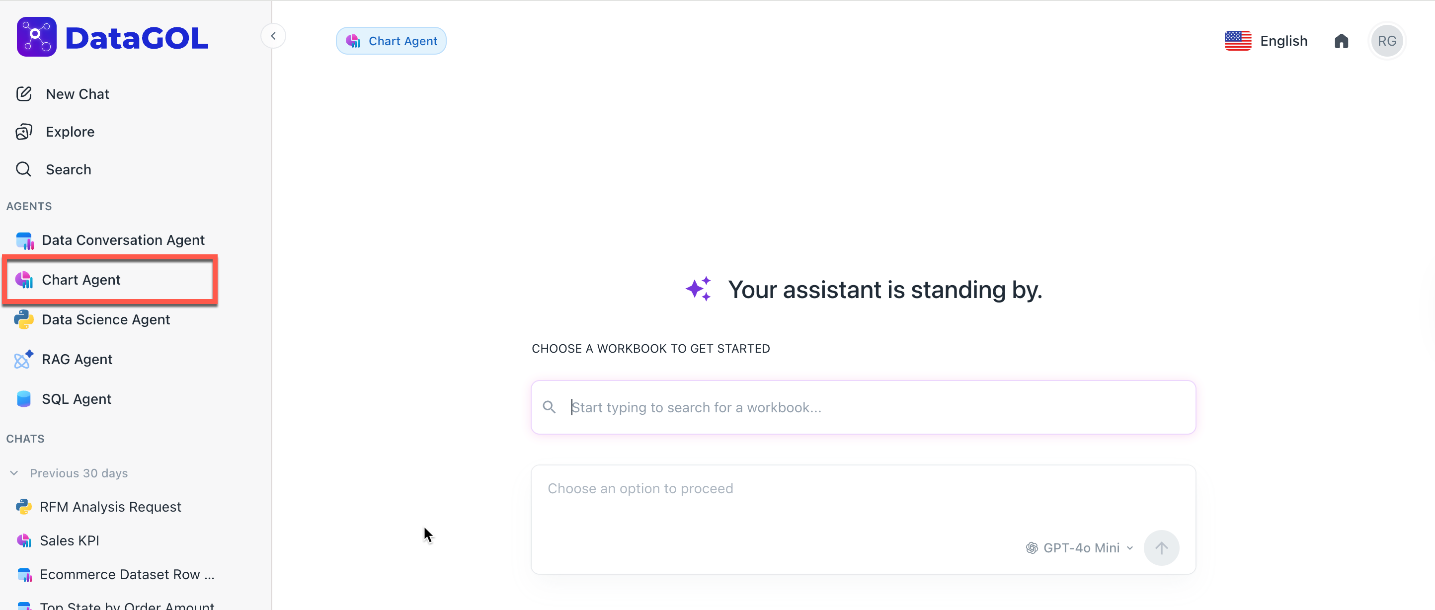
Agents page: Navigate to the Agents tab on the homepage and select Chart Agent. You will then be prompted to choose which workbook you want to query.
[Note]Threads are synced across both locations to ensure a seamless workflow.
-
-
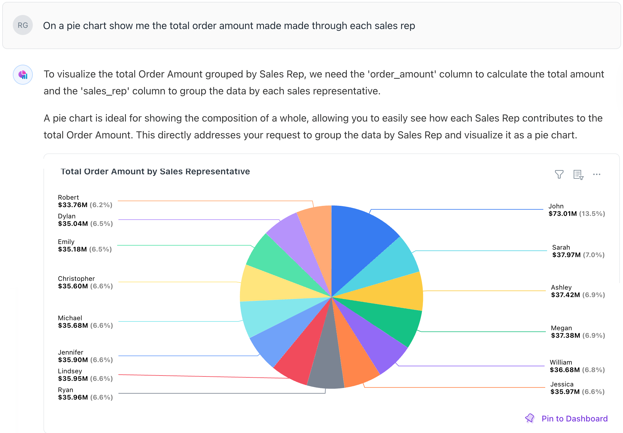
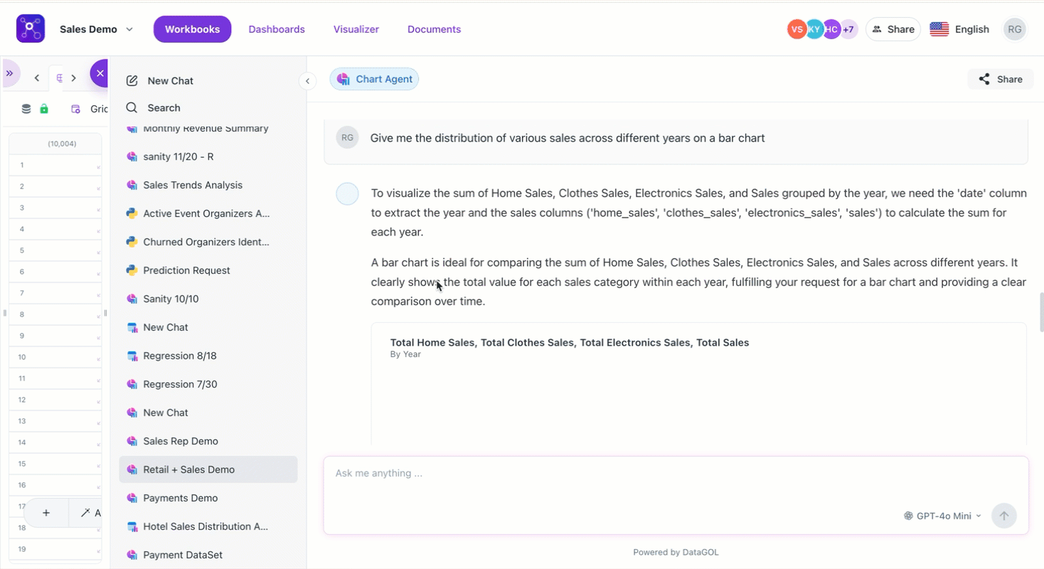
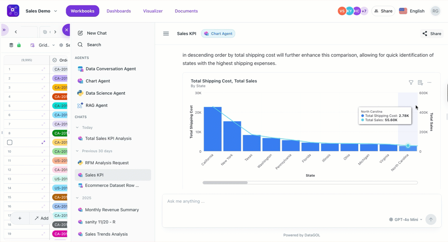
Query the Chart agent using natural language
Type your question into the chat thread just like you are talking to a person. The Chart agent is conversational, so you can adjust your results without starting over.
-
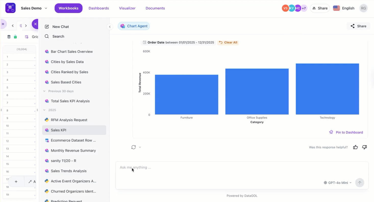
Basic queries: Show me total sales by region for the last year.
-
Specific visualizations: Show me top 10 products as a tree map" or "Create a KPI for total shipping costs.
-
Comparative analysis: Compare budget vs. actuals by month.
The agent automatically selects the best chart type based on the query, or follows specific user instructions:
-
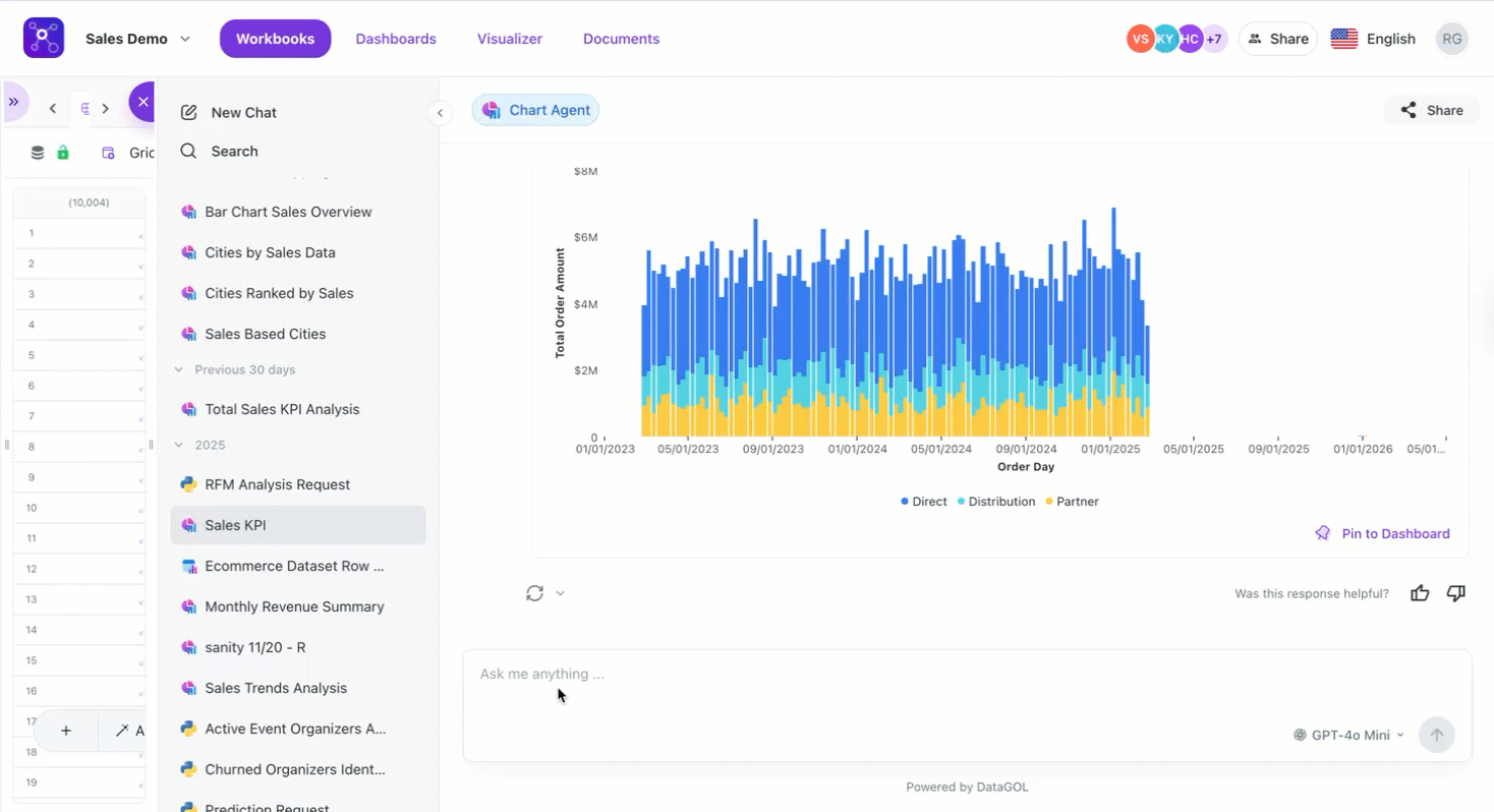
Auto-selection: If a user asks for sales over the last 5 years, the agent defaults to a line chart (best for time series).
Video
-
Explicit requests: Users can specify types like KPI, bar, area, scatter, donut, tree map, pivot tables, or tables.
-
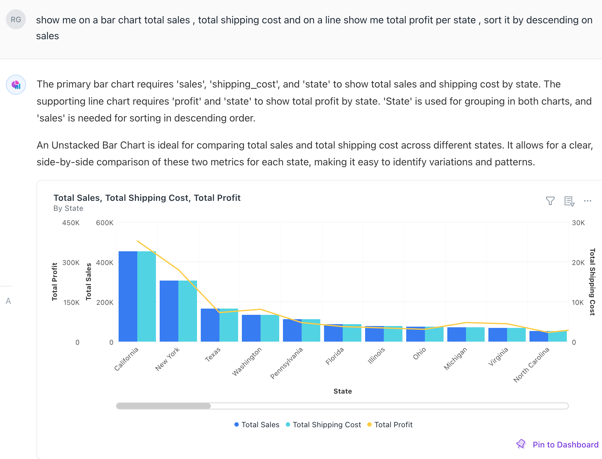
Top/bottom analysis: Users can request top 5 cities based on sales, and the agent will generate a descending bar chart.
-
Combination charts: Visualizing two metrics at once (e.g., shipping costs on a bar chart and sales on a line chart with dual axes).
-
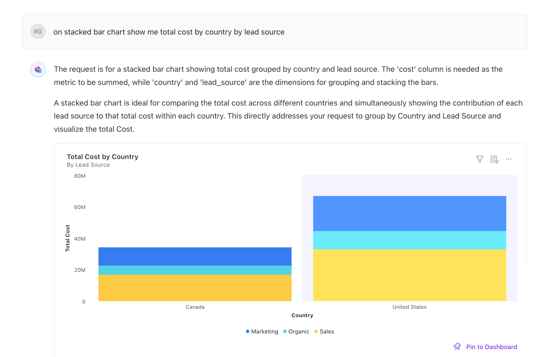
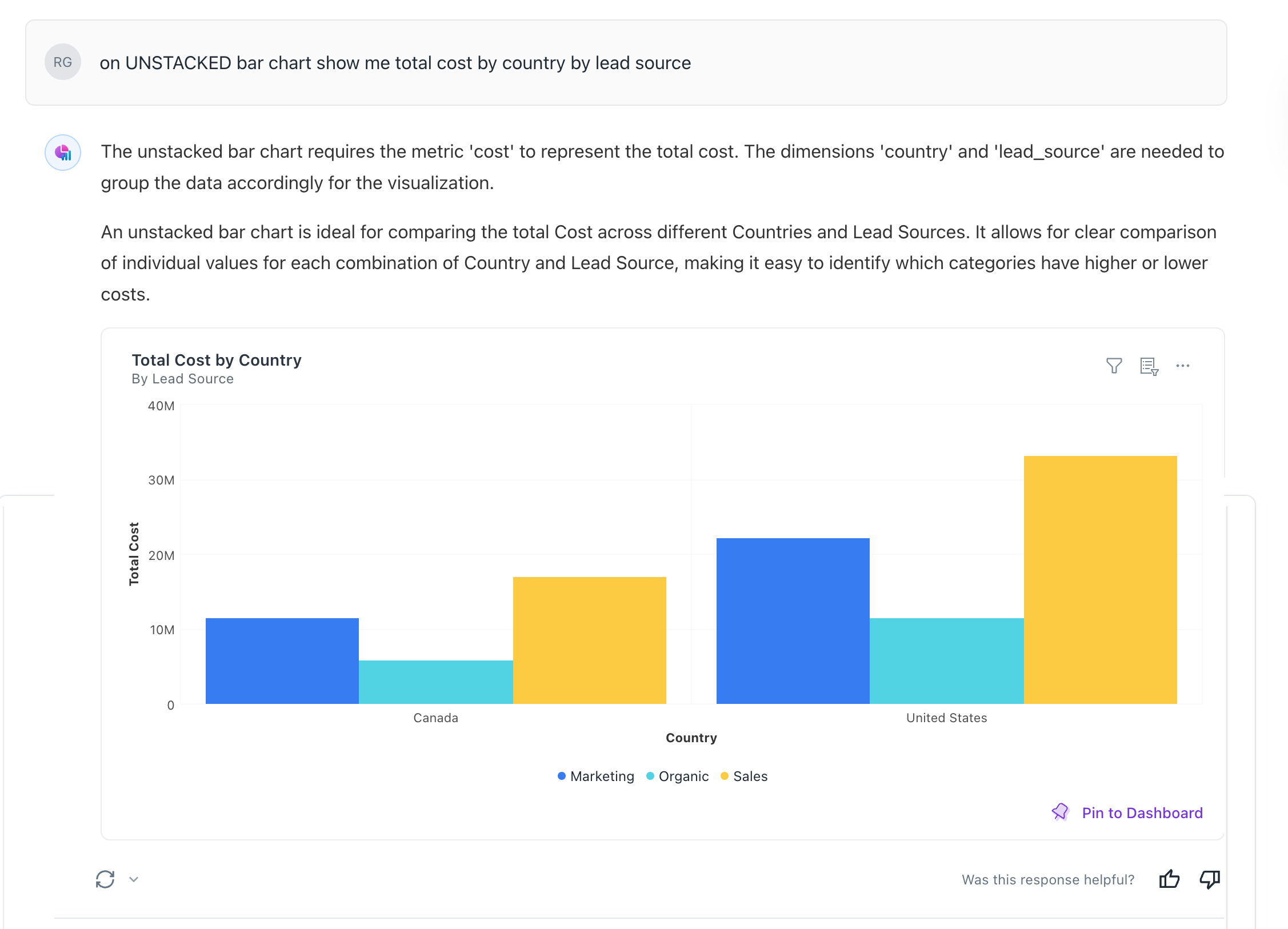
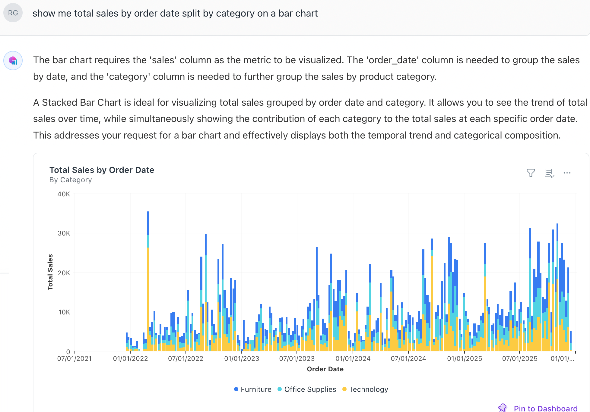
Stacking vs. unstacking: Users can toggle how data is layered. For example, viewing revenue by category stacked on top of each other, or unstacked to see them side-by-side.
-
Dynamic filtering: Users can apply filters through chat (e.g., show only furniture category or filter for the last 3 quarters).
-
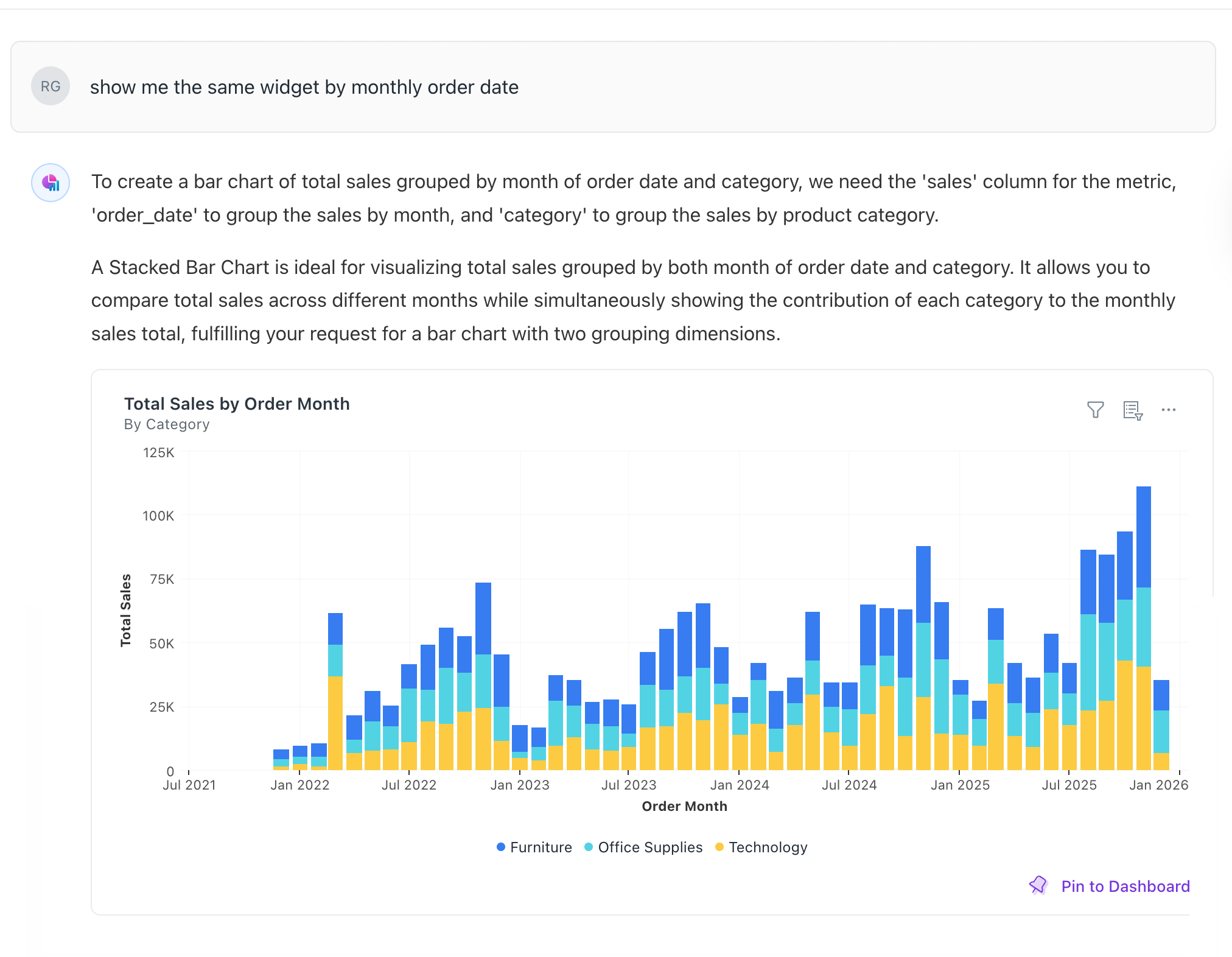
Adjust granularity: Change the time view from daily to monthly.
-
-
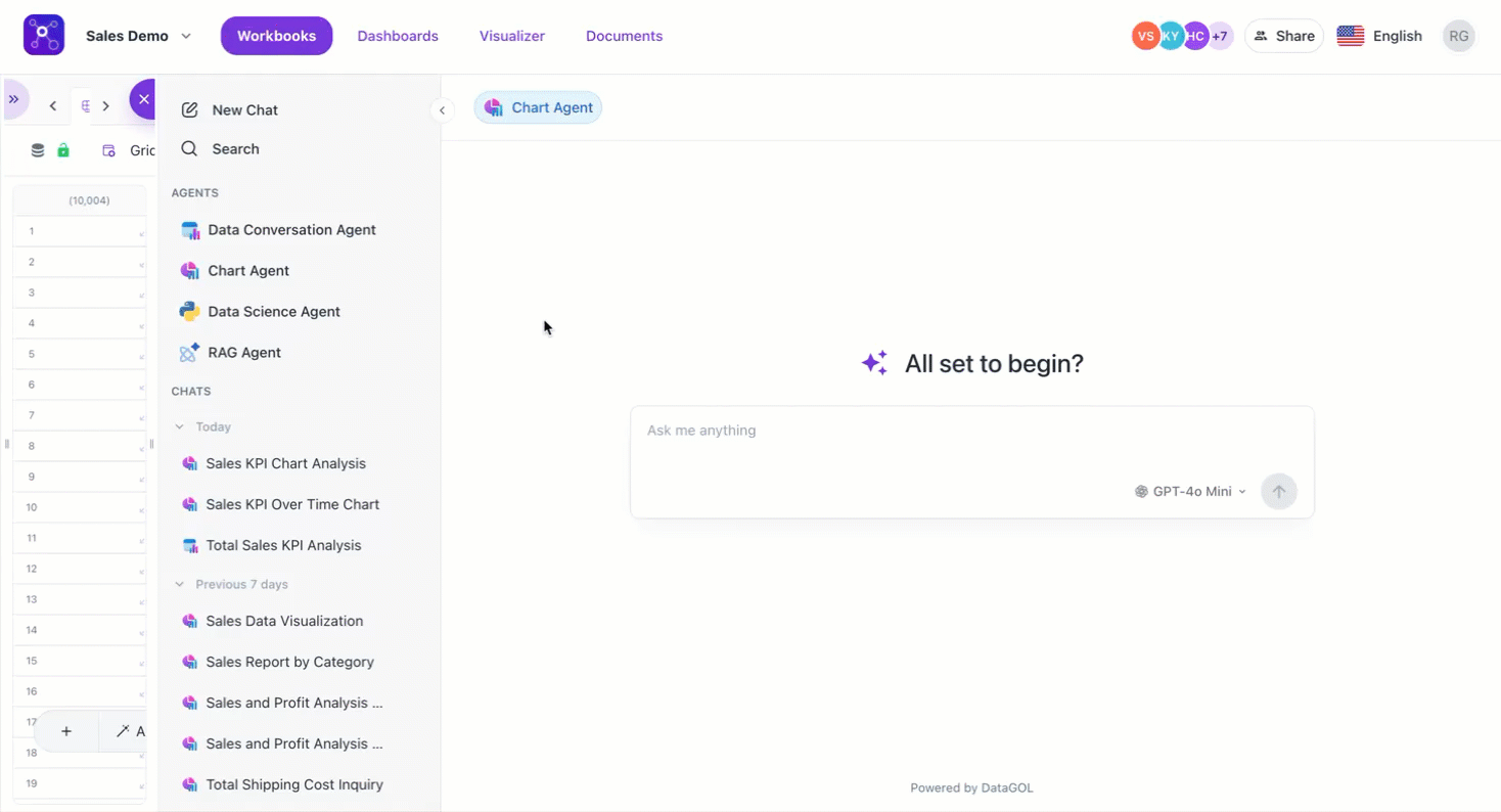
Use the Explore mode
The generated charts can be opened in explore mode.
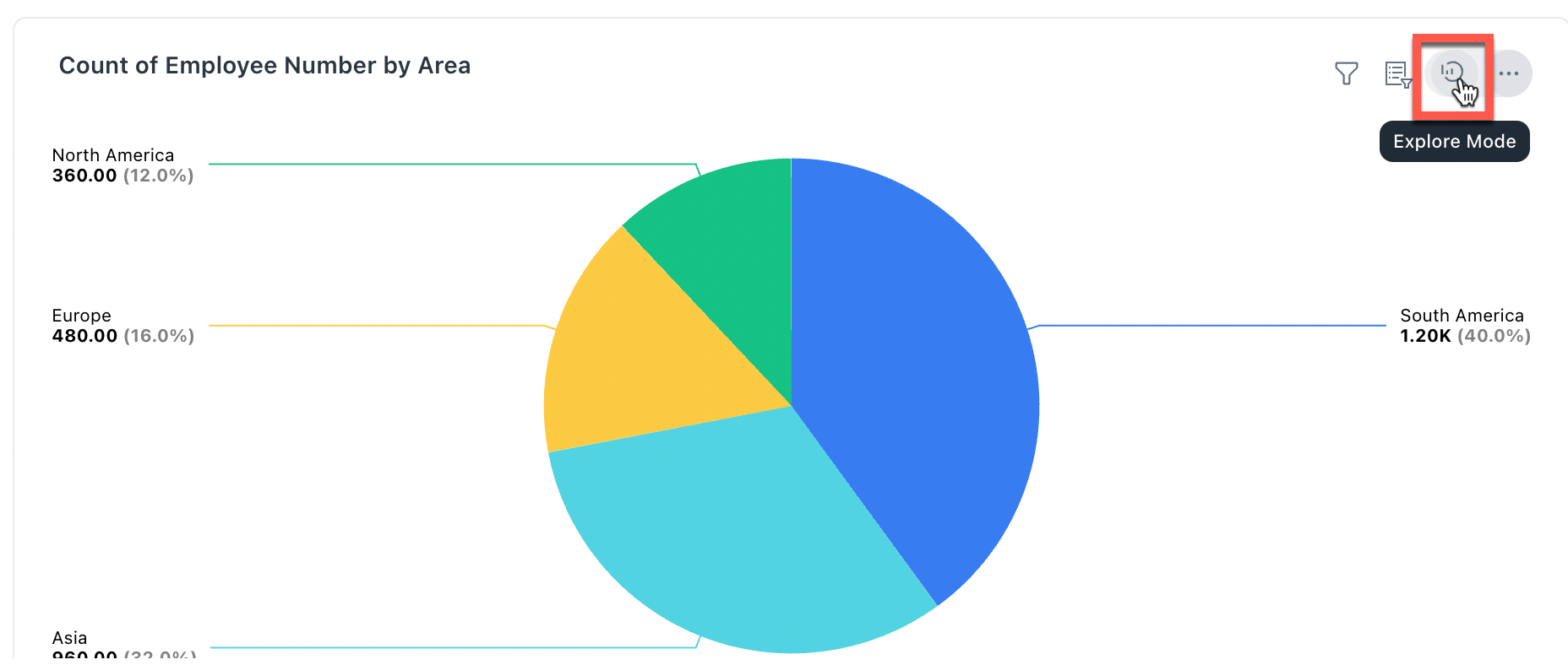
You can apply the filters there and operate the chart in a regular mode. However, the settings you make in an explore mode are temporary.
-
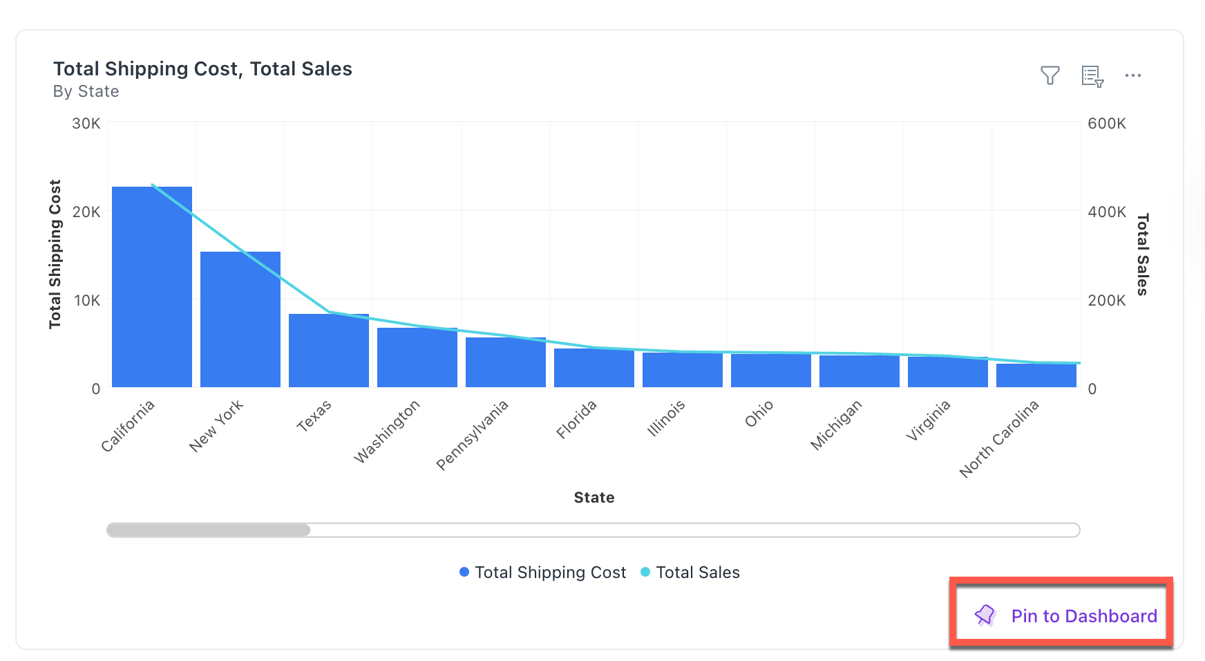
Collaborate and share
-
Pin to dashboard: Once you have the insights, you can pin a chart to the dashboard. An AI-generated chart can be immediately pinned to a dashboard for future reference. Refer to Click Pin to Dashboard
-
Share the thread: Use the share button to send the entire conversation to team members. Refer to Sharing section
-
Was this helpful?